- Published on
Devlog #68 - PxSkillGridNode
Previous: https://www.patreon.com/posts/155330858
I’ve been back in the GUI this week and have made a lot of progress.
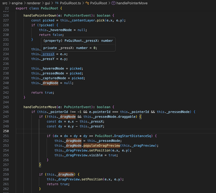
The first thing I worked on was getting proper interaction in place again. UI elements can now be picked under the cursor, which means they can actually be clicked and interacted with instead of just being drawn on screen. That sounds obvious, but until that is working you do not really have UI yet, you just have images.
Once that was in place, I moved onto drag and drop.
In the old client, drag and drop had turned into a pile of very custom behavior and one off hacks. In the new client, the dragged thing is just another GUI node. There is a normal content layer for the regular UI and an overlay layer for things that need to render on top. When dragging starts, a preview of the slot gets placed into that overlay layer and follows the cursor. That means it naturally appears above everything else without needing special rules just to keep it visible.
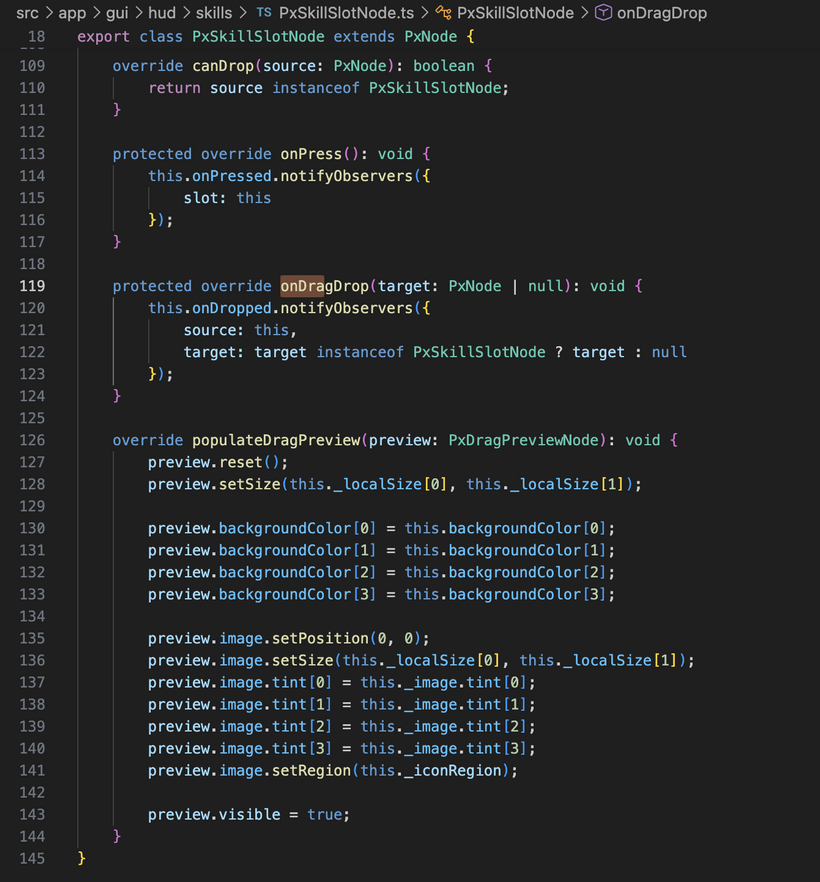
That also means the slot itself controls what its drag preview looks like. Right now for skills that is just the slot background and icon, but later on the same approach can be used for stack counts, ranks, item quantities, or whatever else a dragged thing needs to show. It is a much better shape than trying to hardcode drag behavior in one central place.
On the rendering side, I replaced the old rectangle only GUI batching path with a combined rectangle and image path.
Up until that point, a lot of the GUI work was basically colored boxes just to prove out layout and interaction. That was useful for getting the structure right, but it obviously does not get very far once you want real UI. The new batch can draw both solid rectangles and textured UI elements through the same pipeline, which made it possible to move past placeholders and start showing real assets.
That led straight into getting UI images working properly in the new system.
The skill icons are now actually drawing in the new GUI. Each skill slot is a normal GUI node with a child image node inside it. The icon URL comes from the skill definition data, the image is loaded through the GUI resources, and the slot displays the correct icon. That was a really nice milestone because it stopped being fake UI and started becoming the real game data flowing into the real client.
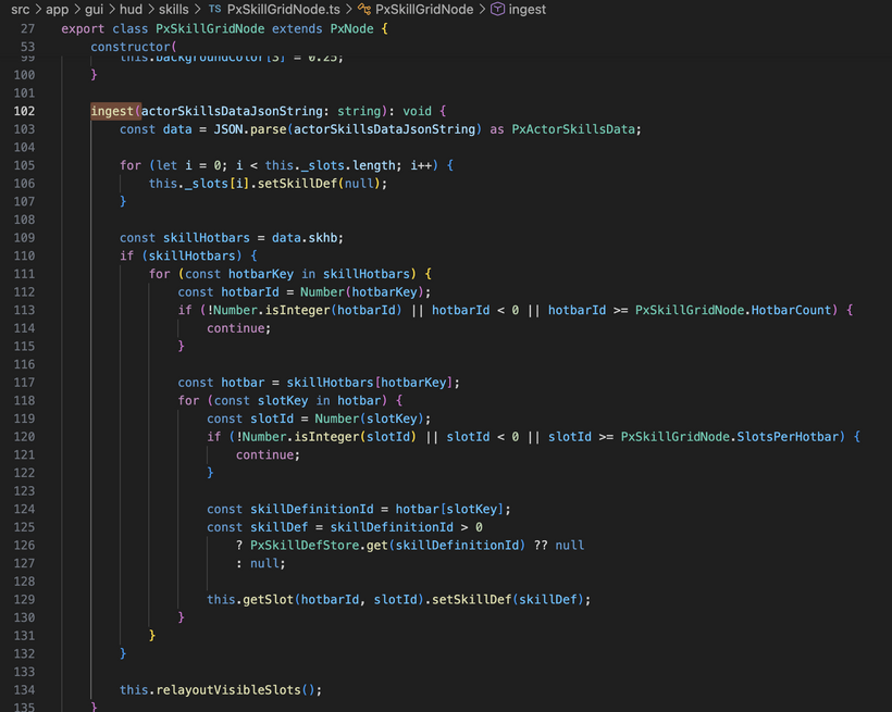
On the data side, the player skills message is now hooked up as well. The client ingests the incoming skill definitions into a shared store, ingests the actor skill data for the main player, and then the skill grid resolves what each slot should show from there. That ended up being the right shape. The definitions live centrally, the grid consumes them, and the individual slot nodes are only responsible for presentation and interaction.
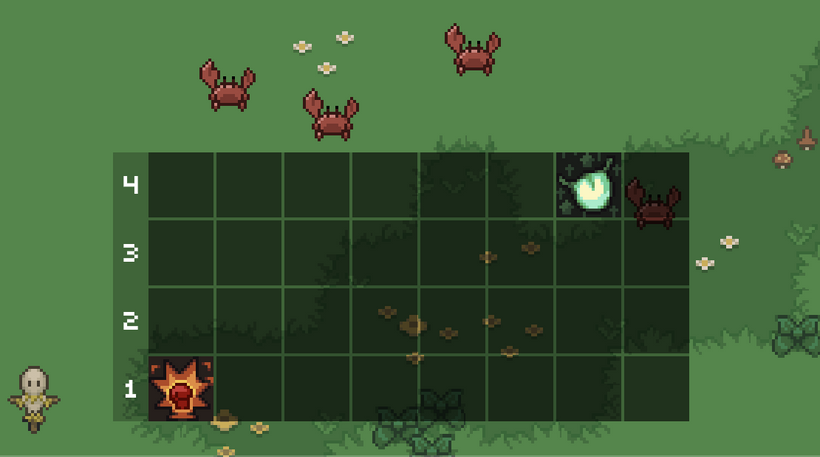
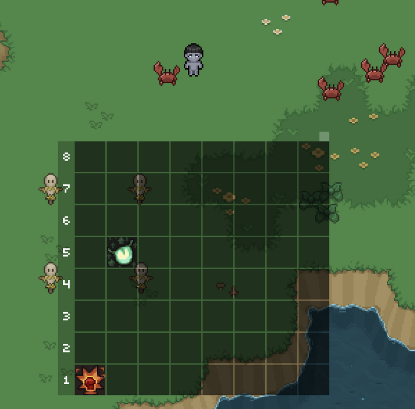
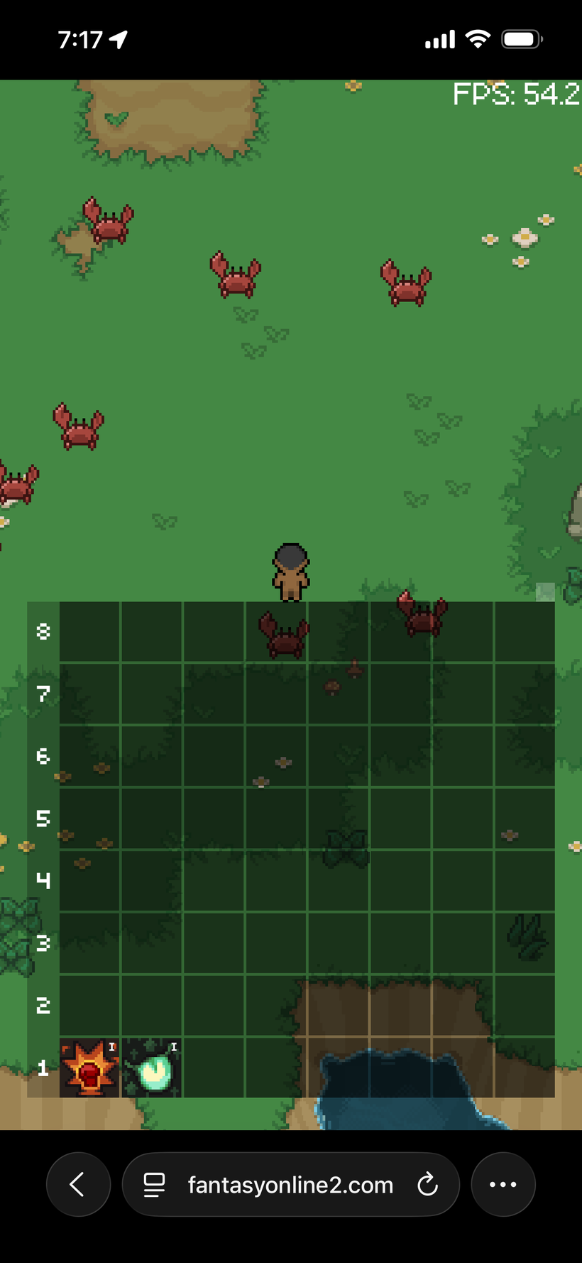
I also spent time fixing the grid layout itself.
The visible ordering was off at one point, so rows that should have appeared in one place were ending up flipped around. That is corrected now. The grid is laid out in the right direction and the visible section matches what the game actually expects instead of feeling upside down.
The underlying structure is also much cleaner now. The full set of skill slot nodes exists up front and the grid just shows the visible section of that data. That avoids constantly rebuilding the UI and keeps the mapping between game state and visible state a lot simpler.
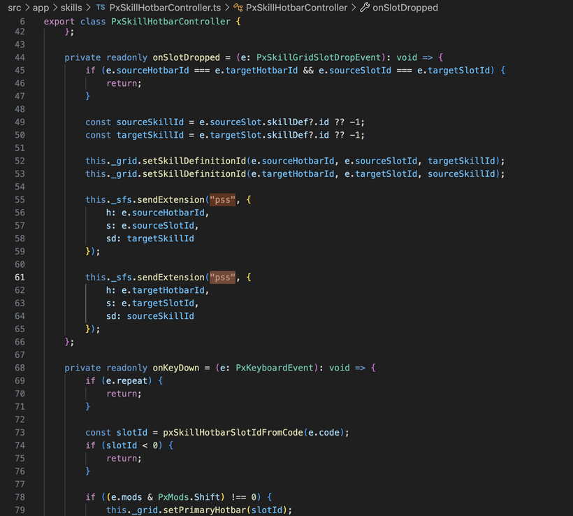
Dragging skills between slots is now connected to the server side slot change messages too. So this is not just a local visual test anymore. When you drag one slot onto another, the client can update its local view and send the corresponding slot changes back to the server so everything stays in sync.
There has also been a lot of smaller refinement work mixed into all of this.
I tightened up the node structure, cleaned up how layout and transforms are propagated, and kept pushing the API toward something that actually feels nice to use while building UI. That matters a lot because once the first real interface pieces are in, every rough edge in the node system starts showing up immediately.
Another useful cleanup this week was around font handling.
We now have multiple MSDF fonts in play, and the old setup had font loading living directly inside the engine. It worked, but it was starting to feel out of place. So that has been pulled into a dedicated font store. Fonts are now just startup resources that get loaded once and then accessed cleanly wherever they are needed. It is a much better fit for how the rest of the engine is starting to be structured.
The most encouraging part of this week is that the new GUI system is starting to prove itself.
A lot of things that used to turn into special case code are now just composition. A skill slot is a node. Its icon is a child node. The drag preview is a node in the overlay layer. A cast overlay can just be a node with a colored background. Rank text can just be another node anchored into a corner. That is exactly what I wanted this to turn into.
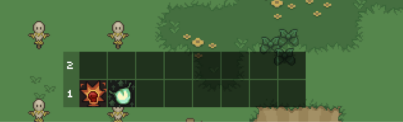
Look how nice it's starting to come together! This shows the ability to display more than one hotbar at a time with new hotbar number labels that are big and clear. SHIFT+NUM has also been hooked up once again so we can flip through the hotbars.
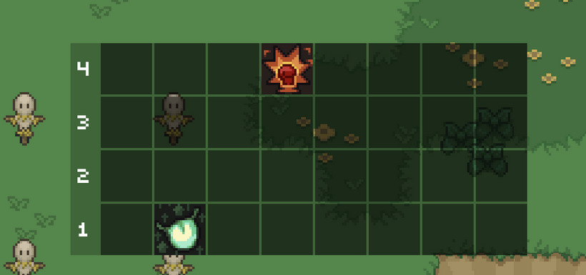
Check it out! You can even drag drop between the multiple visible skill hot bars. How cool is that? And then what do you think happens when you do say SHIFT+4?
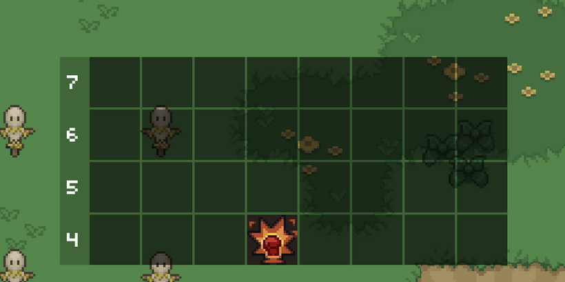
SHIFT+4 moves the 4th hotbar down into the main hotbar positioning. Pretty sweet. Those numbers on the left don't look completely centered correctly though and we still need number hotkeys in the top left and rank numbers in the top right of the skill node. But dang, we're making some amazing progress that I'm excited to play the game with. I wonder if we should have hotkeys for all the visible hotbar skill nodes and if so what should they be?
Ohhh, looks like we had a bug in the PxTextNode. It turned out this was because I was using the font’s advance width to size the text node, which doesn’t actually represent the visible pixels of the glyph. Fonts can have negative side bearings, meaning the rendered character can extend outside of that logical width. The fix was to switch to using the layout’s tight bounds, which describe the actual rendered quad extents, and offset the draw so the glyph’s true visual origin lines up with the node. After that, centering behaves exactly as expected because the node now reflects what’s actually on screen rather than the font’s internal spacing.
No that's one good lookin' skill hotbar grid! Now we need to give players a way to resize the height of the grid. Maybe a handle on the top right might work well? Let's try it.
After adding dragging in-between states to the core of the PxNode and PxGuiRoot, I was able to then add a little square node to the top right that if you drag it, it grows and shrinks the visible hotbars. This feels amazing. Let's look at it in a video.
Holy crap, that's awesome. I could have never built such a system with BablyonJS. All hail PxEngine! It's only going to get better from here on out! With that being said, let's get the rest of our skill slot code all hooked up!
And there we go, the casting overlay is now implemented and completely ported over. Rank text is now drawing on the skill icon and is also drawing in the drag preview node. The skill slot code from the old engine is now about 90% complete!
But, what a minute...
Why is mobile Safari now throttling to as low as 50fps when all 8 hotbars are displayed? It's time to do some debugging and figure out what optimizations we need to implement!
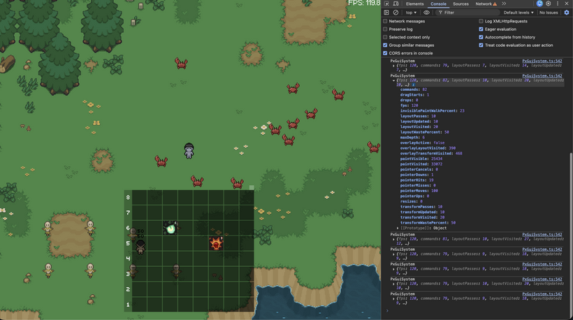
That kicked off a pretty solid round of debugging.
At this point I had enough of the system in place to actually see what was happening instead of guessing. I added debug counters for layout, transforms, paint, input, and overlay work so I could track where time was going and how much of the tree was being touched each frame.
The first issue showed up pretty quickly. Dirty propagation was reaching way further than it needed to. Small changes inside a single slot were causing large parts of the grid to get visited. After tightening that up, layout and transform work became properly localized. Instead of touching everything, it now only updates the nodes that actually changed.
The casting overlay needed a rethink as well. The initial version was resizing and repositioning the node every frame, which meant it was constantly triggering layout. That is not the kind of work you want for something that is just a visual fill. Switching it to a paint-driven approach fixed that. The node stays stable and only the rendered fill changes over time.
I also cleaned up how the overlay layer is used. Drag previews now live fully outside of the main UI flow. That keeps them from interfering with layout and makes the behavior much easier to reason about. It also sets things up nicely for future effects like icons or coins flying across the screen without touching the main UI tree.
The last piece was paint traversal. Even when most of the grid was hidden, the renderer was still walking through a lot of nodes that never made it to the screen. Adding pruning for invisible branches cut that down significantly. When only a few rows are visible now, the renderer only walks those rows.
Safari dropping frames ended up being a good forcing function. It pushed the system into a state where unnecessary work became obvious and had to be addressed.
So while it started as a performance problem, it turned into a pass that made the whole GUI system tighter. Less wasted work, cleaner separation between layers, and a better foundation for everything that comes next.
Next up I think it's time to add local storage settings so we can save the height of the skill grid locally per platform... but that's for next time. That was an intense week. We have a very nice GUI foundation now and I can now continue to port over and improve FO2's full GUI hierarchy.
Thank you to all Patrons. This PxEngine is really turning into something great and I couldn't do it without you. Thank you.
Have Fun & Keep Gaming!
P.S. - Next devlog is in 2 weeks as Hidden Reef comes out on Friday!