- Published on
Devlog #72 - PxItemTooltip
Previous: https://www.patreon.com/posts/devlog-71-158819942
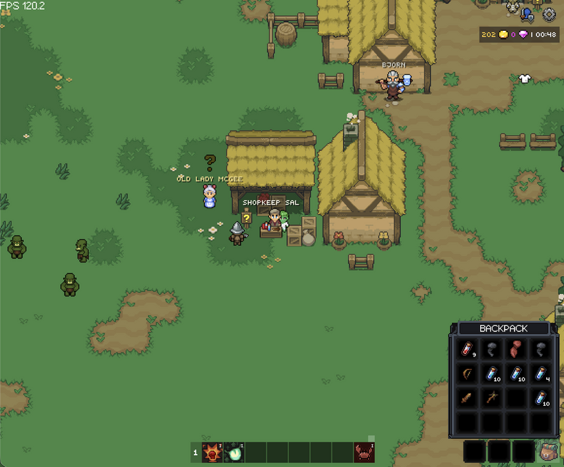
The video above is probably the best summary of where the retained GUI is now. It shows the first couple Noob Island quests running through the new client flow: accepting quests, completing quests, seeing reward items fly into the inventory, opening the loot window, looting drops with flyout feedback, inspecting items on mobile, and using touch tooltip action buttons instead of relying on desktop hover behavior.
Now let's talk about how we got there!
Last devlog ended with the new tooltip foundation starting to come online. The quest window could show reward items, item display nodes had basic hover behavior, and the retained GUI finally had a proper path for showing simple item and skill names without every window needing to invent its own little tooltip system.
This week kept going on that path, but moved tooltips from “the plumbing works” toward “this is starting to feel like the real game UI.”
The first improvement was making tooltips smarter around item slots. Item slots are a little different from plain hover labels because they can have two different jobs. If there is an item in the slot, the player expects a real item tooltip. If the slot is empty, the player still needs to know what the slot is for. Equipment slots, outfit slots, and implant slots should explain themselves even when nothing is equipped.
So empty character slots now have proper hover labels. Empty equipment slots can tell you they are Head, Chest, Main Hand, Ring, Trinket, and so on. Empty outfit slots can tell you they are Head, Face, Fight Line, Mount, and the rest. Empty implant slots can tell you Brain, Heart, Left Arm, Right Arm, Left Leg, and Right Leg.
That sounds tiny, but it matters. A character window full of empty boxes is easy to understand when you already know the game, but new or returning players should not have to guess what every slot means. The interface should explain itself where it can. Hovering over an empty implant slot and seeing “Brain” is small polish, but it makes the window feel more intentional.
This also cleaned up the behavior inside the slot node. A slot can now fall back to its normal hover label when it does not have an item. When it does have an item, it uses the item tooltip path. From the player’s point of view, that is just how it should work. From the GUI side, it means slots can support both simple labels and richer item content without special casing every character tab.
I also tightened how mouse tooltips update while the pointer is moving. Tooltips need to follow the pointer closely, but they also need to update their size and position immediately when their contents change. If the tooltip changes from a short empty slot label to a larger item tooltip, the overlay should not wait around and briefly appear in the wrong place. It should resolve quickly enough that the tooltip feels attached to the cursor instead of lagging behind the interaction.
This is one of those systems that only stands out when it feels wrong. When it works, nobody thinks about it. That is the goal.
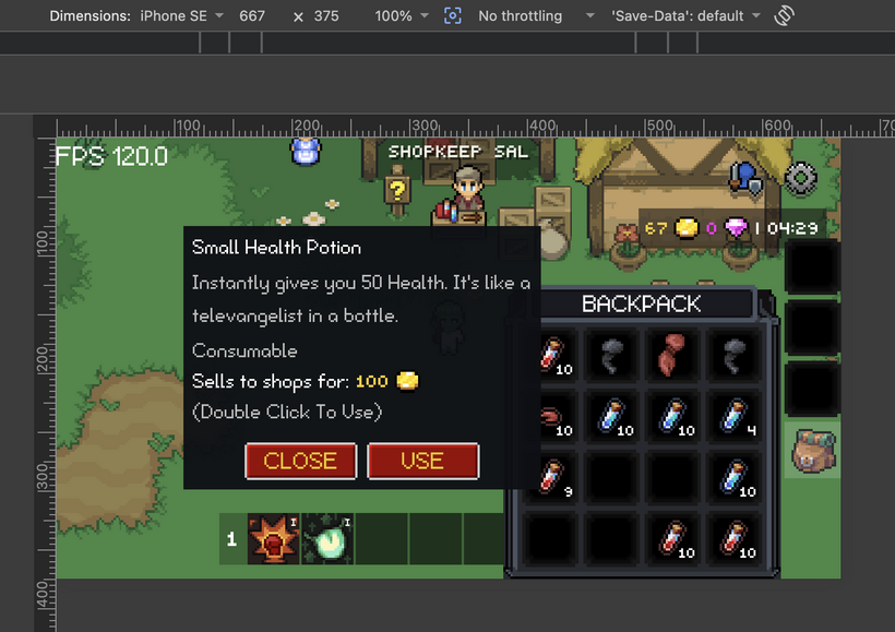
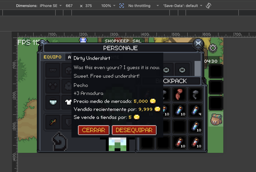
The richer item tooltip path also moved forward. The new retained GUI tooltip can now carry much more of the information players expect from the old client. It can show the item identity, type, equipment slot information, damage range, attack speed, stat bonuses, requirements, set bonus details, sell information, market information, and usage hints where they apply.
That makes a big difference because tooltips are not just decoration in a game like this. They are how players compare gear, understand rewards, check requirements, and decide what to do with items. Inventory, bank, equipment, outfit, implant, and quest reward UI all need to lean on the same item information instead of each window having its own partial version.
The bigger tooltip change this week was touch support.
Desktop has hover. Mobile does not. That sounds obvious, but it changes the entire interaction model. A normal mouse tooltip can appear near the cursor and disappear when the cursor leaves. A touch tooltip needs to behave more like an inspection surface. It has to stay on screen, remain readable, avoid going off the edge, and give the player a way to close it.
So touch tooltips now have their own retained tooltip surface. They can be opened by tapping or holding depending on the node’s tooltip mode, and they stay visible until the player closes them or does something that should dismiss them. The touch tooltip also clamps itself inside the screen bounds so it does not wander offscreen on small displays.
The layout needed a bit more care than the first version. The bottom of the touch tooltip now has an action row instead of one hardcoded button shoved off to the side. The row uses the same kind of button sizing behavior as the modal buttons, so button width can grow with localized text instead of assuming English labels will always fit. The buttons are centered as a group, with the normal GUI button gap between them.
The close button stays on the left. The context action button sits on the right and only appears when the selected thing actually has an action.
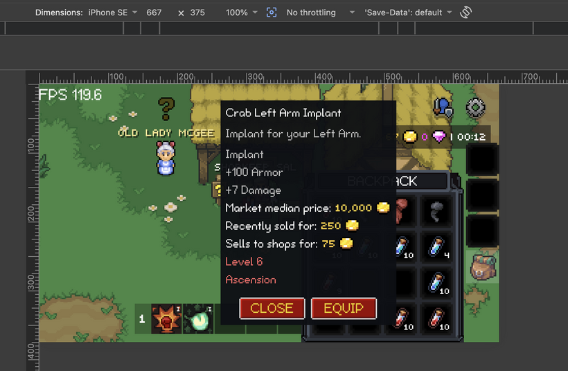
For item slots, that means the touch tooltip can now show real item actions. If the item is equipped, in an outfit slot, or in an implant slot, the action is Unequip. If the item is in a bag and is equippable, the action is Equip. If the item is in a bag and is consumable, the action is Use. If there is no useful action, the button stays hidden.
That is the important difference between a mobile inspect UI and a fake hover UI. The tooltip is not just showing information. It can also expose the action the player probably wanted next.
The ownership split stayed important here. The renderer owns the generic touch tooltip surface: scrolling, sizing, button layout, close behavior, action button plumbing, and screen containment. The renderer does not know what “Equip” means. It does not know what an implant is. It does not know what a consumable is. The item slot owns whether it has a context action and what label that action should show. The inventory controller owns what happens when the action is activated.
That feels like the right split. The GUI foundation provides a generic action slot. The app decides what the action is.
The tooltip also needed to become scrollable. Item tooltips can get tall, especially when they include requirements, stats, prices, set bonuses, and hints. On a small screen, a tooltip cannot just keep growing downward forever. The touch tooltip now has a scroll area above the button row, so the content can scroll while the close/action buttons remain available at the bottom.
The next visible piece was item flyouts.
Looting an item used to be a very quiet interaction in the retained GUI. The item would go into a bag slot, but there was not much feedback connecting the thing you clicked to where it ended up. That is fine for debugging. It is not great for a game.
So there is now a loot flyout layer. When an item moves into the inventory from certain actions, an icon can fly from the source position to the destination slot. It is small visual feedback, but it makes the UI feel a lot more alive. Clicking a loot drop and watching the item fly into your bag tells your brain what happened instantly.
That same flyout path now gets reused in more places. Quest reward items can fly from the quest reward display into their assigned bag slots when the quest is completed. Shop purchases can fly from the shop item display into the inventory. Quick-moving items can also fly toward the destination area when appropriate, such as equipment, bank, or bags.
The nice part is that the flyout target does not have to be only an item slot anymore. In some cases the exact destination slot is visible. In other cases, a window button or another GUI node is a better target. If the character window is closed and an item quick-moves into equipment, flying toward the character button still gives the player useful feedback. The system just needs a GUI node to fly to.
That makes the effect flexible without making the flyout layer know game rules. The flyout layer only knows how to animate an icon from one screen point to the center of a target node. The inventory and action handlers decide when that feedback is appropriate.
The quest window got another round of work too.
Last time, the quest window could show reward items. This week, completing a quest became a much more complete interaction. When the quest completes, the client finds the empty bag slots that will receive the item rewards, marks those slots pending, sends the completion request, and launches item flyouts from the reward display nodes into the inventory.
That is the kind of thing that makes the quest window feel connected to the inventory instead of being a separate dialog that just disappears.
The loot window also moved into the usable flow.
Looting from drops now goes through the inventory controller instead of having UI code send network messages directly. That matters because the controller owns the local slot decision and pending state. If an item can stack, it tries to use an existing stack. If it needs an empty slot, it finds one. If there is no space, the normal constraint path can report that the bags are full. Once the pending slot is chosen, the action handler sends the server request and the flyout can show where the item is going.
This is a much cleaner ownership line than the old style where every UI click handler knew too much about server packets, inventory state, and visual side effects. The retained GUI pieces emit intent. The inventory controller owns inventory logic. The network action handlers send the actual messages.
That same cleanup happened for inventory actions more broadly. Swap, combine, consume, loot, shop buy, and shop sell are now routed through the controller and action handlers instead of mixing server sends directly into slot UI behavior.
That is a big deal. Inventory code gets messy extremely quickly if every click path has its own local version of “is this allowed, what should be pending, what packet do we send, what optimistic UI change should happen.” Moving that into a central controller makes the rest of the UI easier to reason about.
Shop support was the other big gameplay piece this week.
The shop window can now buy items. Buying checks currency, finds a target inventory slot, applies optimistic currency and item changes, marks the target pending, sends the buy request, and plays the flyout from the shop display into the inventory.
The optimistic item path matters because the UI should respond immediately. If you buy an item and nothing appears until the server round trip completes, the shop feels sluggish. If the item appears instantly with a pending state, the interaction feels much closer to the old client while still letting the server remain authoritative.
I recorded a second video specifically for this shop and mobile stress test. I open the shop, hammer on buying stackable potions that stack up to 10, switch between a bunch of mobile screen sizes in Chrome DevTools, open the mobile item tooltip, use the tooltip action button, and keep tapping through the touch path.
That video is less of a polished feature overview and more of a “try to break it” pass. That is useful right now because this is exactly where optimistic inventory code can get weird. Buying stackable items quickly is a good test of pending state, stack filling, slot targeting, mobile layout changes, and touch actions all happening at the same time.
I did find an edge case there where stacked shop buys could leave a couple full potion stacks visually stuck in a pending state until refresh. The items were actually there, but the optimistic pending state was not reconciling cleanly when purchases were hammered quickly. That path is fixed now, and the stress test is working much better.
Selling items to shops also came online. Dragging an item onto the shop sell target can sell it. Shift-click selling is also wired through the same shop sell path. The controller checks that the source is a real bag item, that it is not pending, that it has a UID, and that it has a vendor buy price. It also blocks bank, market, equipment, outfit, implant, and bag bar cases from being treated as normal sellable bag items.
There are still some legacy checks to revisit later once the matching systems are in place. The old client checked things like quest item collect state before selling, and that needs to come back when the new quest log path is ready to answer that question cleanly. I left the old logic nearby as a reminder rather than pretending it does not exist. Some comments are temporary, but they are useful when the goal is to port behavior carefully instead of accidentally dropping old edge cases.
The important part for this pass is that the shop now has the core buy and sell loop working in the retained client. You can buy from the shop. You can sell to the shop. The inventory updates optimistically. Pending state prevents duplicate interactions. Flyouts make the movement visible.
That was one of the last big blockers for a real Noob Island pass.
A lot of the work this week was also about modifiers and input events. Shift-click sell requires the GUI input path to carry modifier state through pointer events, press events, pressable controls, and item slot events. That meant the base node press path, pressable node path, and item slot path all had to pass the modifier state cleanly instead of dropping it.
This is another one of those engine details that is not flashy, but it matters. Once modifier state is available in the right place, app code can make decisions without reaching into browser events or special casing one control. Shift-click selling is the immediate reason, but the same path can support other modified interactions later.
The input path also got a small tooltip behavior fix. Pressing on a node that has a tooltip should not always instantly hide it in the wrong situations, especially now that touch tooltips can be interactive surfaces with buttons. The GUI system now has a better distinction between normal tooltip hiding and interacting with the tooltip surface itself.
That was necessary because touch tooltips are now real UI, not just painted text. If the tooltip has a close button and an action button, pointer input needs to be allowed to hit those buttons without the tooltip disappearing before the click can do anything.
The tooltip controller now also understands the idea of a touch action provider. It does not know about items. It only asks whether the current touch tooltip node can provide an action label and activate an action. If it can, the touch tooltip shows the action button. If not, it hides it. That keeps the renderer generic while still giving the app a clean path for mobile item actions.
Localization got a small follow-up because of those new action buttons. The item touch actions have string keys now: Equip, Unequip, and Use. English and Spanish locale files both have entries for them. The touch tooltip buttons use localized retained text, so they follow the same language refresh path as the rest of the GUI.
That was one reason I wanted the action row button sizing to use measured button widths instead of fixed numbers. “USE” is short. “DESEQUIPAR” is not. Fixed English button sizes are a trap. The control should measure the localized text and size itself correctly.
There was also a little bit of cleanup around helper ownership. Item definition helpers like “is this equippable?” and “is this consumable?” belong with the item definition code. Container helpers like “is this a bag container?” or “is this a character container?” belong with item types. That keeps item slot code from carrying little duplicated rules that will spread everywhere later.
The retained GUI is at the point where these ownership decisions matter more. Early on, it is tempting to just make the first window work. That is fine for proving a path, but if every new feature leaves rules scattered through random UI nodes, the client becomes hard to maintain fast. This pass kept pulling rules toward the file that owns the concept.
The item slot can ask item helpers whether something is equippable or consumable. It can ask container helpers what kind of slot it is in. It can expose a touch action request. It does not need to own the actual movement rules. The inventory controller already owns quick move and consume behavior, so the touch action just routes there.
That means desktop and mobile item actions share the same underlying behavior. Right click and double click already use quick move and consume. Touch action buttons now use that same controller path. That is what I want: different input surfaces, same inventory logic.
The overall Noob Island flow is now in a much better place.
You can accept quests. You can complete quests. Quest reward items can appear in the inventory with visible feedback. Loot drops can be collected. Items fly into their destination slots. Items can be inspected on desktop and touch. Mobile tooltips have close and action buttons. Items can be equipped, unequipped, and used through the same controller paths. The shop can buy and sell. The inventory can swap, combine, consume, loot, and transfer items through the retained GUI path.
That is the point where the new client starts to feel less like a collection of ported windows and more like something you can actually play.
There is still more to port, and there will definitely be bugs. Some old edge cases still need the matching new systems before they can be restored cleanly. Skill tooltips still need richer content. Some mobile flows will probably need more iteration after real testing. But the core path needed to play through Noob Island is ready now.
That is the milestone I wanted to reach.
If you want to help, this is the time to start playing through Noob Island in the new client and taking notes. Be picky. Write down bugs, confusing quest steps, awkward pacing, missing explanations, weird rewards, bad tooltip behavior, mobile issues, anything that feels wrong or unclear.
You can send those notes to [email protected]. I read everything people send, and I respond to almost all messages.
The goal is not just to make Noob Island technically work in the new retained GUI. The goal is to make the beginning of the game better while this work is happening. If something feels bad, confusing, too slow, too easy to miss, or just not fun, I want to know.
Have Fun & Keep Gaming!
P.S. - See you on Friday for the new Summer zone!