- Published on
Devlog #69 - PxWindowNode
Previous: https://www.patreon.com/posts/devlog-68-154223404
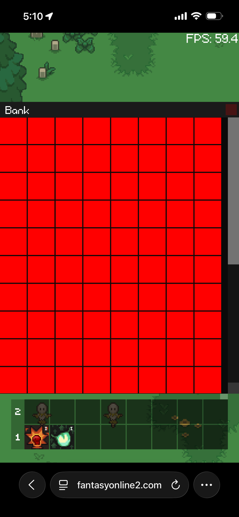
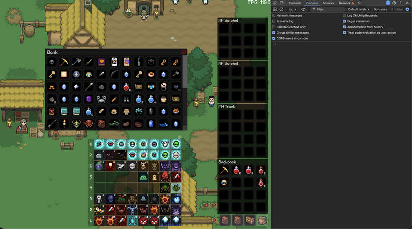
It's time to start creating windows and have a window manager take care of them all. I'm going to start with the bank window as that will require a full implementation of the item slot system as well. As you can see we're starting out strong here with a single window frame with a header and the concept of padding. Now, how about we take it a step further and have it be draggable?
And just like that we now support dragging windows by their title bar. I will have to put in a lot of safeguards to make sure the window stays on screen at all times but this is a great start. I'll also have to hook this up into our local settings system that will be coming along shortly. That way the window will stay where it was between logins and it will be per platform.
From there I started working through the actual window behavior instead of just the visual frame. The first thing I wanted was for windows to behave like real windows. They need to know how big they want to be, how small they are allowed to become, how large they can grow, and how to stay inside the game screen no matter what device you are playing on.
That led into a proper layout constraint pass. Windows can now size themselves from their content, clamp themselves to the available screen, and keep their position inside the parent bounds. This is especially important for mobile because a window that looks perfect on desktop can instantly become unusable on a small portrait screen. The bank window now asks for its preferred full size, but if the screen is too small it shrinks down and lets the internal scroll area take over.
The next big step was anchoring and pivot support. This is what lets a window say “my center belongs in the center of the screen” instead of only thinking in top left positions. That sounds simple, but it affects everything. Dragging, resizing, centering, and keeping a window on screen all need to agree on what position actually means. After working through that, windows now have clearer movement helpers so the low level node system can keep its anchor math while the window system can move things in normal window space.
Once that was in place, the bank window could finally start behaving like the old bank window again. It now opens centered, sizes itself from the item grid, and defaults to showing all bank slots on larger screens. On smaller screens it still fits inside the viewport instead of overflowing off screen. That means the same window can work on desktop, tablet, and phone without needing a completely separate layout.
I also added a resize handle to the bottom right of the window. Resizing had to be handled carefully because the bank window is centered by its pivot, but a resize handle should feel like the top left corner stays planted while the bottom right corner moves. That is now working properly. You can drag the handle, the window respects its min and max size, and the scrollbars update around the available space.
So at this point the bank window is doing a lot more than just drawing a frame. It is centered, draggable, resizable, constrained to the screen, sized from content, scrollable, and responsive to different screen sizes. That gives us a real base for the rest of the window system instead of a one off implementation for the bank.
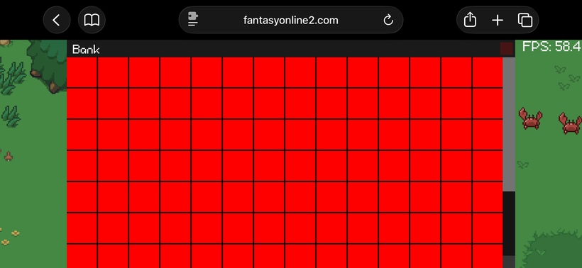
The bank also needed a real grid instead of a bunch of manually placed controls. I now have a grid node that understands slot size, spacing, padding, minimum size, preferred size, and maximum columns. The bank uses that to say it wants to show the full 14 by 10 layout when it can, but it can also shrink down to a tiny 6 by 6 view for small phones. That gives us a much better path than hardcoding one size and hoping every device can handle it.
That grid lives inside a scroll node, which is now its own proper piece of GUI infrastructure. The scroll node owns a viewport, content area, scrollbars, and draggable scrollbar thumbs. The viewport ended up being really important because hidden scrolled content should not be clickable. If an item slot has been scrolled out of view, it should not be able to steal input from the window title bar or anything else above it. The scroll viewport now clips both drawing and picking, so what you see and what you can interact with finally match.
So now we have more than just a bank mockup. We have the start of a reusable window system, a reusable grid, a reusable scroll container, proper clipped scroll interaction, window focus ordering, and a bank window that behaves correctly across desktop and tiny mobile screens. This is the kind of foundation work that is slow to show off at first, but it is going to make every future window much easier to build.
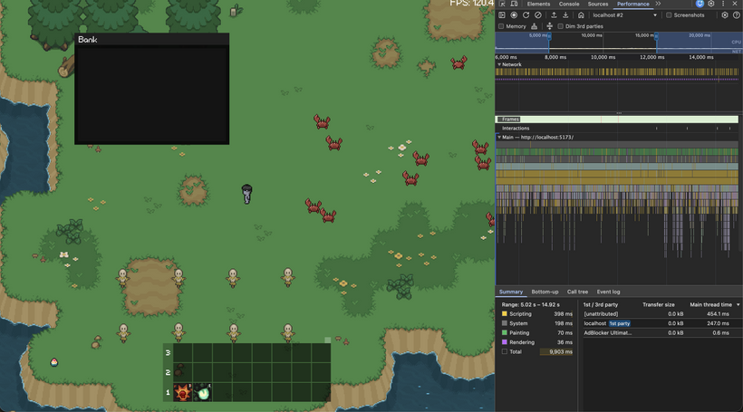
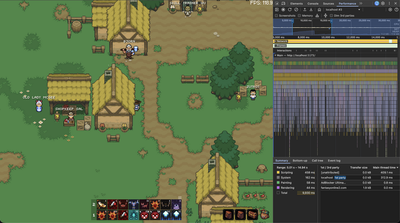
From there I took a detour into performance, because once the bank window was full of real item slots it became a much better stress test for the GUI system. A window frame is easy. A scrollable bank full of item slots, icons, overlays, text, clipping, dragging, resizing, and focus behavior is where the system actually starts to prove whether the design is going to hold up.
The first thing I did was add much deeper GUI debug output. I wanted to see exactly what the tree looked like, how many nodes were visible, how many draw commands were being produced, how many commands were scoped for batching, and what parts of the tree were being dirtied during normal interaction. That made it a lot easier to separate “this feels slow” from “this exact subtree is rebuilding too often.”
That profiler work immediately showed a few useful patterns. Moving a window, dragging an item, resizing the grid, and idling with nothing changing all have very different performance shapes. When nothing is changing, the GUI should be doing almost no meaningful work. When a single window moves, the system should not need to relayout or repaint every item slot from scratch. When the bank grid changes size, it is expected that more of the grid needs to update, but it still needs to stay bounded and predictable.
The biggest optimization pass was adding a paint cache for GUI subtrees. Instead of walking the entire GUI and rebuilding every paint command every frame, stable parts of the tree can now reuse their previous display lists. If a node and its subtree have not changed, the renderer can append the cached commands and keep going. That is especially important for things like the bank inventory, where most slots are completely static most of the time.
This also forced a cleanup of the dirty flag system. Layout, transform, and paint dirtiness are now treated more carefully. A node moving does not necessarily mean the visual contents of every child changed. A layout change does not always mean the node needs to repaint its own local contents. Getting those distinctions right matters because the cache is only useful if it can tell the difference between “the pixels changed” and “the same pixels are now somewhere else.”
Once the paint cache was in, I took a zero garbage pass over the GUI rendering path. The display lists now retain their command objects and reuse them frame to frame instead of allocating new command objects every draw. The traversal stacks are retained arrays. Debug stats are retained objects. The paint cache keeps retained display lists per node. The goal is that normal GUI frames do not create a stream of short-lived objects for the garbage collector to clean up later.
The bank window itself also got some polish from all this testing. Resizing a grid-based window exposed an ugly issue: partial slots. If the user resized the bank to a width that landed halfway through a slot, the result looked sloppy. The bank now snaps its usable content size to whole slot columns and rows, so resizing feels much cleaner. The window still respects min and max constraints, but it avoids showing awkward half-slot blank space.
The important part is that this is still general infrastructure. The bank is just the first window using it. The same window manager, layout constraints, scroll views, clipping, dirty flags, paint cache, and batching path will be used by future windows too. Inventory, skills, settings, crafting, shops, and anything else that needs a real interface should all benefit from this work instead of each one becoming its own custom UI island.
The video above shows where this work landed after the next round of cleanup. This is one of those updates where the actual game screen starts looking simple again, but underneath it a lot of old UI behavior has been rebuilt in a much cleaner way. The bank was the first major test case, but the next problem was the one I have wanted to clean up for years: bags.
The old bag system worked, but it was always one of those areas where the code had grown around years of edge cases. Bag slots, bag windows, the bag bar, item movement, stack combining, double click behavior, right click behavior, drag previews, server validation, and mobile layout all ended up tangled together. It was functional, but it was exactly the kind of system where every small change felt dangerous.
For the new engine I wanted to split that apart properly. An item slot is now just an item slot. It knows how to draw its background, draw its icon, draw stack text, show a drag preview, and report when it was clicked, double clicked, right clicked, or dropped onto another slot. It does not know how to talk to the server. It does not know about shops, banks, bags, equipment, or loot. It just represents one item instance location.
The actual inventory behavior now lives in an inventory slot controller. That controller decides what a slot interaction means. Dragging one item onto another can become a swap or a stack combine. Double clicking a consumable can send the consume request. Right clicking or double clicking can quick move an item depending on where it lives. When an item operation is sent to the server, the involved slots are marked as pending and fade out so the player cannot keep interacting with them while the server is validating the request.
Once item slots were working again, the next big piece was the bag bar. This is part of the HUD, not the window manager. It may look like it opens little windows, but those panels are really attached to the bag bar and should behave as part of the HUD layout. Treating them like real draggable windows would add a bunch of behavior they do not need. So bags now have their own compact HUD implementation instead of reusing the normal window system.
The layout work here was the tricky part. On a wide screen, the bag bar sits horizontally in the bottom right, just like the old desktop layout. Bag panels open upward from that bar, and if there is not enough vertical space they wrap left into another column. On narrow or portrait screens, the bag bar moves to the right edge and becomes vertical. In that mode the bar is centered vertically, while bag panels open to the left and stack from the bottom of the screen upward. If they run out of height, they move left into another column.
The bag bar orientation is also no longer based on a hardcoded “small screen” flag. Instead, it prefers the horizontal layout and only switches vertical if the horizontal bag bar would overlap the skill bar. That means desktop, laptop, tablet, and phone layouts all follow the same rule. If there is room, the HUD stays horizontal. If there is not, it becomes vertical. I tested this across the Chrome device presets, including iPhone, iPad, and resized desktop layouts, and the same logic held up.
This is also why the video above has the device toolbar and responsive testing visible. The point was not just to make the bag bar look right in one screenshot. The point was to drag the viewport through awkward sizes and prove that the layout keeps behaving. These are the kinds of problems that are easy to miss on desktop and then become painful later on mobile.
So now the new GUI has a much cleaner item foundation. Bank slots, bag slots, drag and drop, server validated swapping, stack combining, consumable use, right click behavior, double click behavior, pending item states, and responsive bag panels are all moving into the new engine in a way that is much easier to reason about. There are still more old inventory behaviors to port, but the ugly core of it is finally becoming a proper system instead of a pile of special cases.
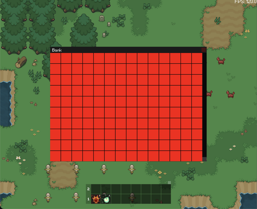
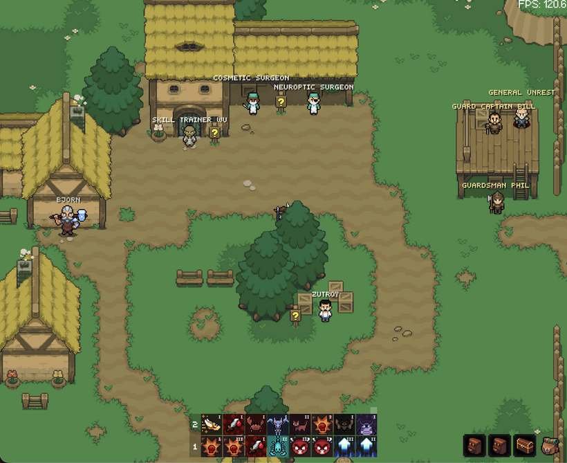
With the inventory foundation in a much better place, I also started bringing NPCs into the new world renderer. NPCs in Fantasy Online 2 are a little unusual because they are not really actors in the same way players and enemies are. They do not need combat state, movement prediction, health updates, fight lines, death handling, or any of the other actor machinery. They mostly need definition data, a sprite, a world position, and interaction behavior. So instead of stuffing them into the actor system, I added a small NPC system that owns live NPC sprites for the current zone while keeping NPC definitions cached separately.
The screenshot above shows the first pass of NPCs appearing in the new engine. This is not the full interaction port yet, but it is an important milestone: zone changes now load NPC definition data from the server, spawn the correct NPC sprites into the world, and clean them up when changing zones. From here I can start wiring clicks back into shops, quests, crafting, travel dialogs, signs, and all the strange little special-case NPC behavior the old engine accumulated over the years.
After NPCs were spawning correctly, I started making them behave more like real parts of the world again. They now resolve from world clicks back to their NPC definitions, which gives us the path we need for shops, quests, crafting, travel prompts, banks, signs, and all the weird special-case NPC behavior from the old engine.
I also brought NPC names into the overhead text system. They use the same world text path as damage numbers, XP popups, and other floating text, but with a softer off-white color and a small shadow so they stay readable without blasting your eyes on bright map tiles. I’m still tuning exactly which names should show, because I don’t want the screen turning into a wall of labels.
A lot of this round was also spent profiling. Stable GUI sections now cache more than just paint commands. Rects, images, and GUI text can reuse prepared render data instead of being rebuilt from display commands every frame. I also removed a WebGL text path that uploaded transform data through a texture, which was exactly the kind of browser-side cost I wanted to avoid after dealing with similar issues in the old engine.
So this pass added the first real NPC world behavior, gave NPCs overhead names, and pushed the renderer further toward a lower-garbage, lower-CPU path. There is still a lot of NPC behavior left to port, but the new engine now has the pieces needed to start bringing back shops, quests, crafting, travel, and the rest of those interactions.
Now let's take a crash course in allocators.
https://www.youtube.com/watch?v=GZ6PuLikw84
At a very high level, an allocator is a system that manages a pool of resources and hands out pieces of it when something asks. In traditional programming, that usually means memory. A program requests some bytes, the allocator finds a free block, and returns it. When the program is finished with that block, it can be returned to the pool and reused.
The important detail is that an allocator is not just a container of memory. It is an algorithm and a data structure that decide how pieces of that memory get divided, tracked, reused, and sometimes thrown away over time. Different allocators make different tradeoffs. Some are designed to handle many tiny allocations quickly. Some try to minimize fragmentation. Some are built for raw speed when the shape of the data is predictable.
Game engines use custom allocators all the time because the problems are usually very specific. Instead of managing completely arbitrary chunks of memory, we often know exactly what kind of thing we are allocating. Particles, sprites, text glyphs, UI images, and animation frames all follow patterns. When the workload is predictable, the allocator can be much simpler and much faster.
That is exactly what we did in a previous devlog with our sprite atlas allocator.
Sprites in Fantasy Online 2 are mostly uniform. A player sprite sheet, enemy sprite sheet, or item icon family tends to use repeated images of the same dimensions. Because of that, the texture atlas can be treated as a fixed grid of slots. If every cell in a given atlas is the same size, the atlas does not need to search for oddly shaped free space. It just hands out the next available slot. Allocation becomes extremely simple.
That works beautifully for things like item icons and skill icons. Hundreds of images with the same size can share one uniform atlas page, and each new icon is just placed into the next available cell.
But GUI art is a different kind of problem. A slot background, a currency icon, a button, a portrait frame, and a decorative panel piece are not guaranteed to share a size. If I force all of those into the uniform atlas system, every unique size gets its own fixed-cell atlas family. That is where the waste shows up. One odd image can create an entire mostly-empty texture page.
So I added a second atlas allocator for mixed-size GUI art.
This new packed atlas uses a simple shelf layout. Images are placed left to right across a row. When the row runs out of space, it starts a new row underneath. If the page fills up, it creates another page. It is not trying to be a complicated packing algorithm. GUI art is mostly loaded and reused, so predictable and simple is exactly what we want.
The important part is that both atlas allocators return the same kind of texture region. The renderer does not need to know whether an image came from the uniform atlas or the packed atlas. Once the image has a texture, rectangle, and UV coordinates, the draw path is identical.
That gives the engine two tools instead of trying to force every image through one allocator. Repeated same-size images stay in the uniform atlas. Mixed-size GUI art goes into the packed atlas. As more windows, buttons, frames, and decorations come online, that should keep texture usage much cleaner.
The bank window, bag panels, item slots, NPCs, and atlas systems are all starting to come together, but the UI still needs to look like FO2. The next pass is going to focus on taking this new GUI foundation and teaching it how to use proper skinned art again, without bringing back the old hardcoded Babylon GUI hacks. You will soon be able to customize much of the look of the GUI however you want!
Have Fun & Keep Gaming!
P.S. - Next devlog is in 1 week.