- Published on
Devlog #70 - PxSkin
Previous: https://www.patreon.com/posts/devlog-69-156557100

What do you think of the new loading screen? It's space full of stars that increase in numbers as parts of the engine load and then increases in speed once it's nearly ready. Go to https://fantasyonline2.com/ and check it out on your 5th slot character. I kind of love it. Anyways, this week we're starting to skin the entire FO2 GUI. We're pulling out colors, coordinates, sizes, and more. This is really exciting because anyone will be able to skin the GUI in any way they want once this system is in place. Let's dive in and see how it actually works and how it came to be.
Before we get started on this week's devlog let me show you some of the highlights in a video.
Look at all the new features! Did you notice that if you double click the title bar on a window it centers it? I'm not sure how to convey that to players. There are so many things like SHIFT+B for all bags open and double click to center the window that are hard to convey to players easily. Don't worry, I'll figure something out. I always do. You know this. Anyways, let's start the devlog for real this time. Holy god in heaven this code is going to put me in the insane asylum. it's so complex and requires so much research that I feel like I could write a rival to Windows or macOS at this point. Ok not really, but it really feels like it. Off we go.
So last time I started turning the GUI into a real windowing system. The bank window was the first big test because it needed almost everything at once: a frame, dragging, resizing, a grid, a scroll area, clipped input, and enough item slots to stress the renderer. This time I pushed that same foundation into skins, settings, scrollbars, and the first pass of the top right HUD buttons.
The goal was pretty simple. The skin file should describe how the GUI looks, and the engine should handle behavior, layout, input, drawing, and performance. I do not want window art, padding, scrollbars, buttons, and layout rules scattered all over the app code. The more of that stuff lives in the right place now, the less painful every future window should be.
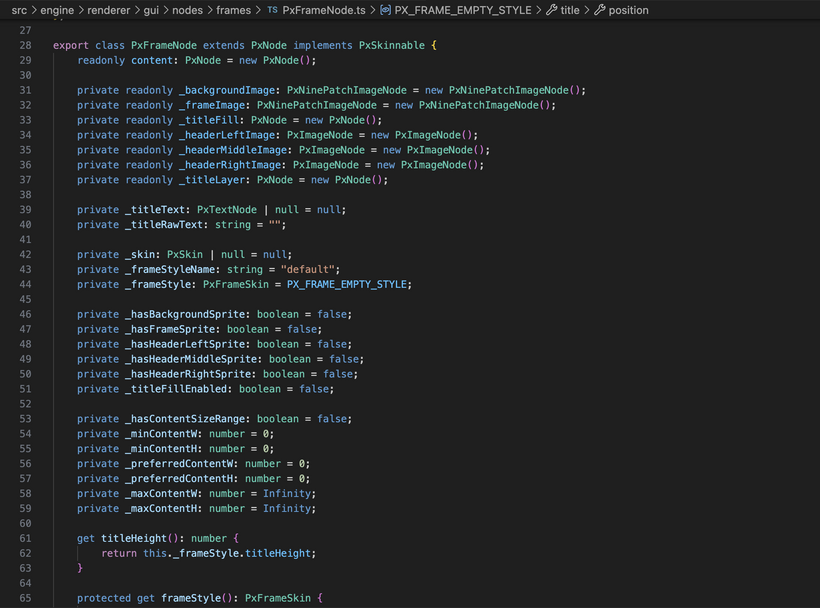
The first cleanup was splitting frames from windows. A frame is the visual shell. It has a background, border, header, title, and content area. A window is behavior on top of that. It can focus, drag, resize, close, and stay inside the screen. That means a bag panel can use a frame without becoming a draggable window. A dialog can use a different frame style. A bank window can be a full window with resizing and scrollbars. The art and behavior are separate now.
This also cleaned up padding. The frame skin now describes chrome, which is the space taken up by the frame itself. It does not secretly add generic padding for every kind of content. Bank, bags, settings, and future windows can all decide their own content spacing.
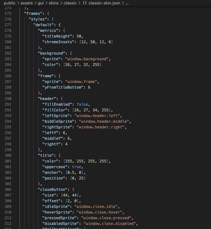
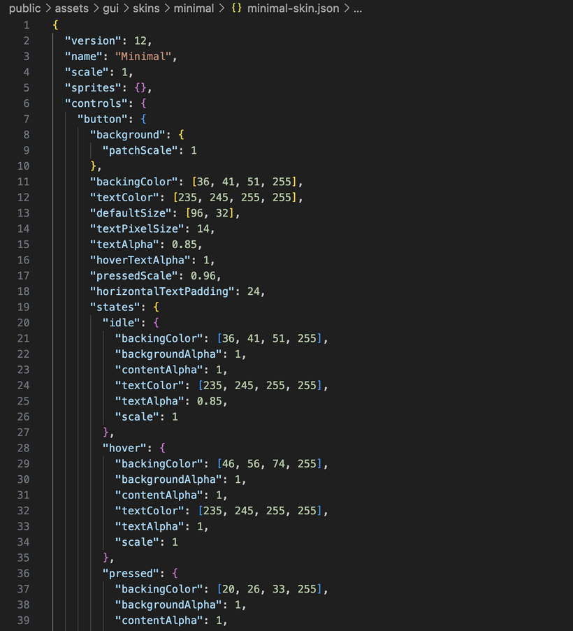
The skin file changed shape too. It now has sprites, controls, and frames. Sprites are raw atlas regions. Controls describe generic control styles. Frames describe reusable frame styles. The classic skin uses the existing atlas art, but I also added a minimal skin that uses no images at all. It is just colors. That forced the renderer to handle image-less skins properly, which is exactly the kind of test I wanted. A skin should not need atlas art just to be valid, and the skin files need to stay easy to edit as more windows come online.
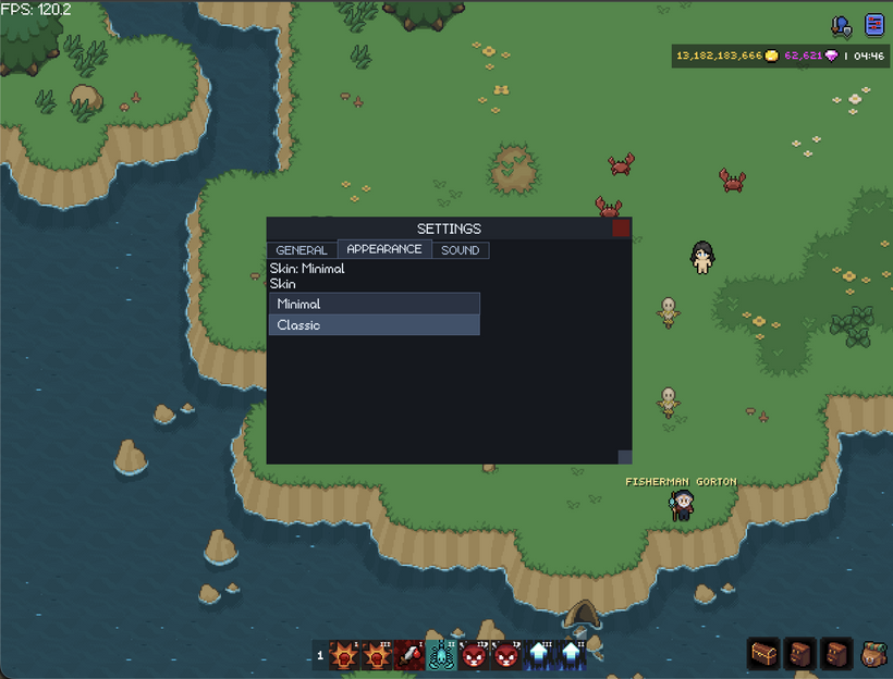
Once the skin format was in a better place, I added runtime skin switching through the settings window. The settings window has a skin dropdown now, and it can switch between the classic atlas skin and the minimal color-only skin while the game is running. Skins are cached and preloaded too, so once they are loaded, switching is instant.
The combo box was the first bigger control rebuilt in the new GUI. I used the old combo behavior as the checklist, but rebuilt it in the new retained GUI system. It supports typed values, selection by value, long scrolling dropdowns, hover states, and selection events. The important part is that it behaves like a real reusable control instead of a one-off settings dropdown.
It also uses a real popup layer now. A combo dropdown should float above other UI. It should not be trapped inside the panel that owns it. The GUI system now has overlay layers for popups, drag previews, and modals. Combo boxes open into the popup layer, clamp to the screen, flip upward if there is not enough room below, and close when clicking outside.
The modal layer is ready as well. A modal can sit above the rest of the GUI and block clicks from reaching windows, bags, or the game world behind it. I am not using it much yet, but it is ready for confirmations and alerts.
Tabs were another big control pass. Tabs are their own reusable control now. The tab bar owns the tab items, selected state, hover and pressed behavior, and its own layout. It can also wrap when the window gets too narrow. That matters for settings because the number of tabs will grow. I want the same settings window to adapt instead of making separate desktop and mobile versions.
Tabs exposed a deeper layout issue too. Some windows were using their current outer size as the source of truth. That can cause slow shrinking or drifting bugs when the skin chrome changes or a window gets resized repeatedly. The fix was to make frames and windows think in content size ranges. A window can say what its minimum useful content size is, what size it prefers, and how large it should ever get. The frame adds its chrome around that.
The settings window uses this now. It is a normal resizable window with a minimum size, preferred size, and maximum size. It can shrink for smaller screens and still lay itself out from the actual content area. The bank needed a related fix too. The bank is grid based, so it wants to snap to whole rows and columns. Skin switching exposed a bug where the bank could slowly change size because it was reusing the current outer size. Now it rederives its size from the preferred grid layout instead.
Bags needed a skin-change layout pass too. Bag panels are framed HUD panels, and their outer size changes when frame chrome changes. I added a post-skin hook so parent layouts can run after children have applied their new skin sizes. Bag panels recompute their own frame size, and then the bag container relayouts the visible panels.
The settings window also moved from placeholder to real settings. I added a generic settings store backed by local storage. The engine owns the storage helper. The app owns the actual setting keys and defaults. That keeps local storage code out of the settings window itself.
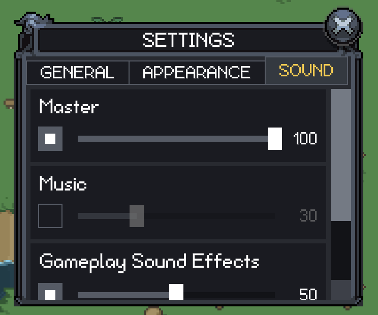
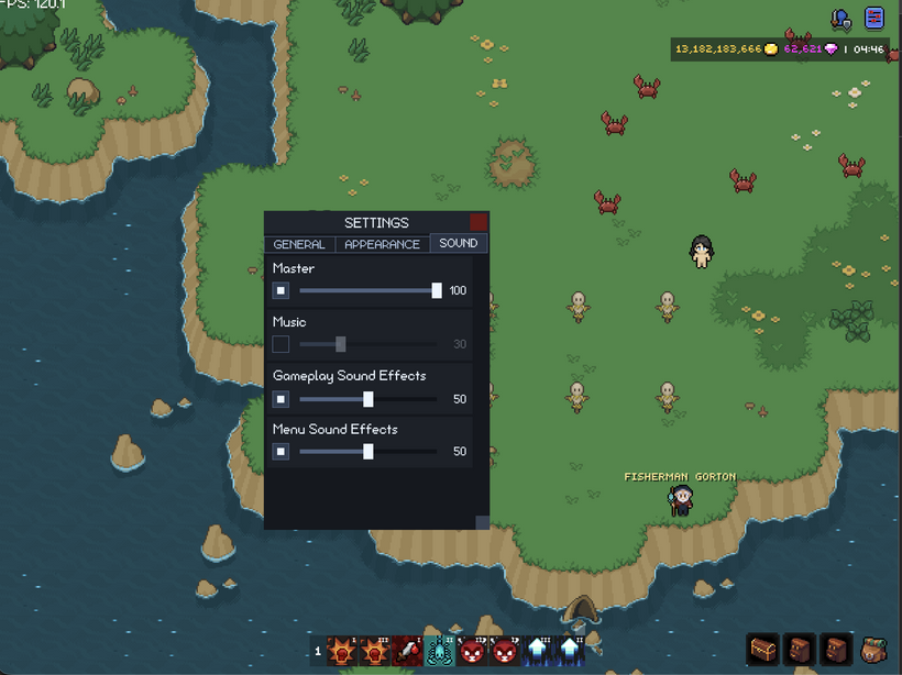
The first real settings page is sound. There are settings for master audio, music, gameplay sound effects, and menu sound effects. Each one has an enabled checkbox and a volume slider. The values are stored locally now.
The slider is a real renderer control. Sound settings use it, but the slider itself is generic and skinned like the other controls. It has the usual pieces you would expect: track, fill, thumb, value, and change events.
The sound rows changed a lot while I was working on them. At first I tried to make each row fit the label, checkbox, slider, and value on one line when there was room, then rearrange when the window got narrow. It worked, but it did not feel right. Long labels pushed everything around and the row got too complicated.
The better version is simpler. The label gets its own line. Under that is the checkbox and slider. The value display belongs inside the slider itself. That makes every sound row stable. Labels do not shove controls around, rows line up cleanly, and the code is easier to understand.
That cleanup led into a bigger settings layout cleanup. The settings page is now built out of reusable layout nodes instead of one giant manual layout method. The shape is scroll, column, section, wrap, row. Each layer has a small job instead of the settings window trying to manually place everything itself.
That is the layout direction I want for the whole GUI. Each level owns its immediate children. The settings window should not know how a sound row works. A sound row should not know about scrollbars. The scroll node should not know what kind of content it is scrolling.
I added a new column layout node for this. It is a generic vertical layout container. It is useful for settings pages, forms, panels, and other UI that stacks blocks vertically. The wrap node also got cleaned up so rows next to each other line up properly instead of having uneven card heights.
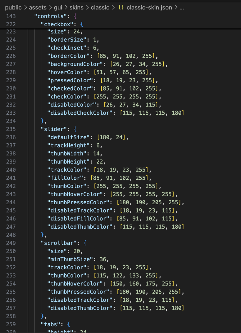
Scrollbars are skinned now too. They were one of the last generic controls still using hardcoded colors and sizes. The scroll model is cleaner now as well. Scrollbars are chrome of the scroll container. They are not part of the content. The viewport can have page padding while the scrollbar stays on the outside edge. This fixed the settings scrollbar behavior and gives bank and settings the same scroll model.
After that I started rebuilding the top right HUD buttons. This area now starts with a generic image toggle button in the renderer. It is built on the same pressable base as the other controls, so hover, pressed, enabled, and pointer behavior all come from the same place.
It supports the normal icon states like idle, hover, open, and open-hover. It also preloads those images so clicking a button does not stall while the next state downloads. The button sizes itself from the actual image instead of using a hardcoded button size.
For the top right HUD, I am using the smaller icon art on all screens. It looks cleaner and avoids needing separate desktop and mobile button bars. The top right HUD now has a window button bar above the currency and clock row. For this first pass there are only two buttons: character and settings. The character window is just a shell right now, but the wiring is there.
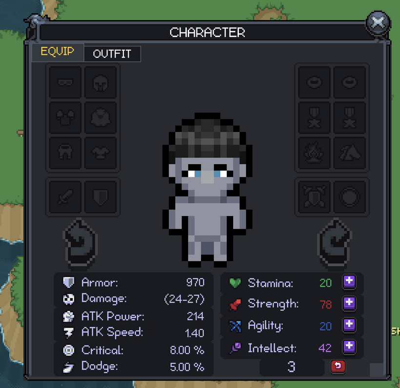
The character window also moved a lot further than I expected this week. It started as a shell, but it is now becoming one of the main tests for the whole skin system. The equipment page has the player portrait, rotation buttons, equipment slots, stat panels, attribute panels, stat point display, stat point spending, and reset confirmation. This was one of the scariest old GUI nodes to port because it did so much in one place. It was layout, item slots, portrait handling, stat rendering, stat points, and reset behavior all smashed together.
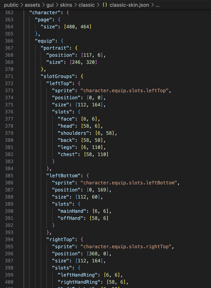
Getting that screen into the new GUI forced the skin system to grow up fast. The character page now has its own skinned layout contract. The page size, portrait rectangle, equipment slot groups, stat panel positions, attribute panel positions, stat point area, reset button, rotate buttons, and fallback behavior can all come from the skin. The classic skin can use the old atlas art. The minimal skin can still work without those sprites. This is exactly the kind of thing I wanted from the skin system. A complicated screen should not have its coordinates trapped forever inside TypeScript.
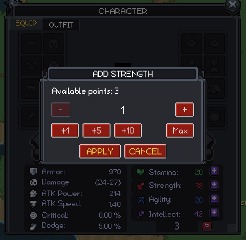
The stat point buttons are working now too. Clicking a plus button opens a modal where you can choose how many points to spend instead of spending one at a time. It has plus, minus, quick amount buttons, max, apply, and cancel. That led to another button cleanup because normal command buttons should activate when you release the mouse, but amount buttons need to react immediately so they feel good when you click quickly.
Buttons got a deeper cleanup because of this. Pressable nodes handle input behavior. Button nodes resolve visual state. Text buttons use skinned button states. Disabled buttons finally look disabled as a whole button instead of barely changing the text. Image buttons and toggle buttons also got fixes so hover, pressed, focused, and disabled states behave more consistently. Touch input mattered here too, because hover does not exist on mobile and the controls need to respect that.
The modal system became useful this week as well. I added a base modal node, a prompt modal, and a confirm modal. The confirm modal is used for stat point reset. It also needed wrapped text, so I added a wrapped text node with horizontal and vertical alignment instead of hardcoding line breaks inside the modal. That gives the GUI a reusable text block for future dialogs and panels.
The character window now has tabs too. Equip is the first mostly complete page, and Outfit is started as the next page. The window uses one scroll node and one active page host, so inactive pages are not sitting around participating in layout, painting, or input. That should make it much easier to add the remaining character pages without turning the window into a disaster.
Outfit inventory is wired now. The outfit container loads, the outfit slots register with the inventory slot controller, drag and drop works through the same system, and quick move knows how to target outfit slots. The visual layout is only a first pass, but the important part is that outfit is now part of the new character window structure.
I also added set metadata support on item definitions and brought back equipment set piece counting. That will matter later for item tooltips and set bonus display. Tooltips are still being held for a separate pass because touch screens need a real plan. I do not want to just copy desktop hover behavior and call it done.
The networking code got a small cleanup too. Incoming server handlers and outgoing GUI action handlers are now split apart. Character stat point apply and reset actions live in their own character action handler instead of being mixed into inventory loading. It is a small thing, but this kind of cleanup matters as the client grows.
So this pass ended up being much bigger than just skins and settings. The visible pieces are the settings window, runtime skin switching, sound sliders, skinned scrollbars, the minimal skin, the top right window buttons, the character equipment page, stat point modals, reset confirmation, and the start of the outfit tab.
The important part is that all of those are sitting on reusable systems now: skinned frames, reusable controls, popup overlays, modal layers, local settings, post-skin layout hooks, cached skins, scroll chrome, column layout, wrap layout, image toggle buttons, app-wide asset helpers, exclusive window management, character page skins, prompt modals, wrapped text, and inventory slot controllers that can now work across more than just bags and equipment.
This is the part of the rewrite where the work starts feeling less theoretical. The systems are not just nice abstractions anymore. They are carrying one of the most complicated old GUI screens in the game, and it is actually working.
Have Fun & Keep Gaming!
P.S. - Next devlog is in 1 week.
P.P.S. - I've attached skin jsons (which are not finished) to show how much is already skinnable in the new PxEngine skin system.