- Published on
Devlog #73 - PxNavigationGuide
Previous: https://www.patreon.com/posts/devlog-72-159517859
Before getting into the rest of the week, I want to start with the new footstep path system because this one has been a long time coming. In the video, I’m all the way at the top-right end of Noob Island, crossing over from Crab Coast, and the footsteps immediately show a path back across the entire zone to the first quest turn-in near the new player spawn point.
The important part is not just that it draws a path. It is fast, it updates as I move, and it can guide the player from one end of a zone to the other without needing the exact movement pathfinder. I have been poking at this idea on and off for probably two or three months, so seeing it finally work in-game feels really exciting. Right now it is focused on returning to quest NPCs, but it feels like the foundation for a much bigger navigation system where players could find any NPC in a zone and eventually auto-follow a path until they decide to take control again.
And with that very exciting thing out of the way, let’s rewind and talk through the rest of the week's work.
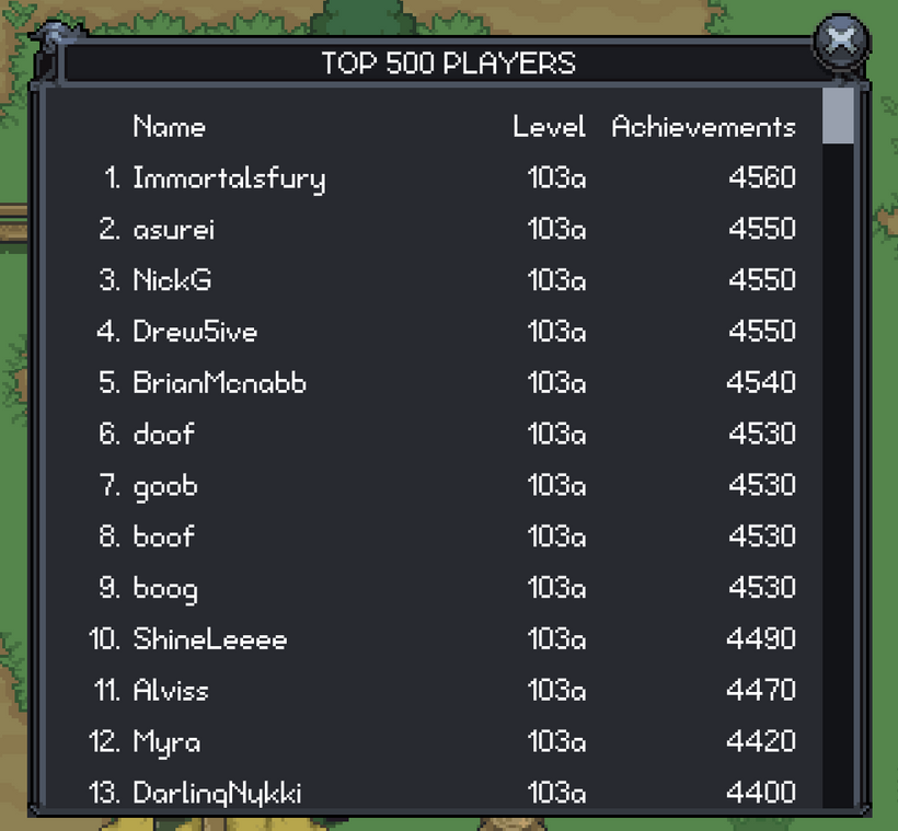
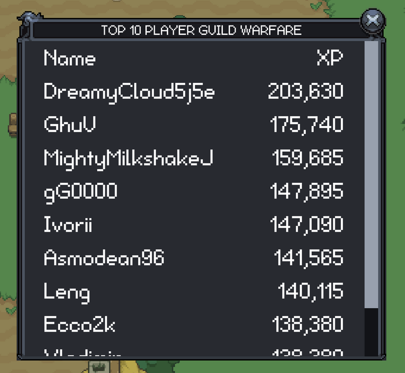
This week started with getting the player leaderboard up and running in the new engine. The old leaderboard worked, but it was very much an old client window. It was basically a few big text blocks sitting inside a scroll view. That got the job done, but it was not a great fit for the retained GUI, and it was not something I wanted to keep copying as more list-heavy windows come over.
The new player leaderboard already looks much cleaner. The columns line up properly, the text uses the current skin sizing, the strings go through localization, and the window has proper loading and failed states instead of assuming the data will always be there.
The part that matters long term is the new virtual scroll list.
A lot of game UI is secretly just lists. Leaderboards are lists. Quest logs are lists. Collector windows are lists. Guild member views, mail, friends, ignore lists, and all kinds of data-heavy windows eventually turn into “show a bunch of rows and let the player scroll through them.” If every one of those windows creates hundreds or thousands of GUI nodes at once, the UI gets expensive fast. It also means every window starts inventing its own scrolling behavior, pooling behavior, and edge cases.
So instead of making the leaderboard a one-off window, I used it as the first real test case for an engine-level virtual scroll list.
The idea is simple from the outside. The list knows how tall the content is, where the scroll position is, and which rows should currently be visible. It only creates GUI nodes for those visible rows, plus a little extra above and below the viewport so scrolling feels smooth. As you scroll, old row nodes get recycled and rebound to new data instead of creating fresh nodes over and over.
From the player’s point of view, it just feels like a normal scrollable list. From the engine’s point of view, a 500 row leaderboard does not need 500 row widgets alive and updating all the time. The same pattern is going to matter even more for windows like the collector, market, guild lists, and anything else that can grow over time. I would rather solve that once in the renderer than keep adding special cases every time a window needs to show a bunch of entries.
I also built a reusable text table on top of the virtual list. That gives the leaderboard proper columns instead of the old “four separate multiline text blocks” approach. The old version had separate text blocks for rank, name, level, and achievements, and then each block got one giant string with a bunch of newlines. That is easy to write, but it is not a great structure. It makes alignment and sizing awkward, and it does not scale well once the UI starts needing richer row behavior.
The new table has real rows and cells. It can measure columns, handle flexible space, keep numeric columns aligned, and update rows in batches so filling the table does not cause a bunch of unnecessary refresh work. The first row is used as the header, and the rest of the rows are the leaderboard entries. It is still lightweight, but it is a much better base than the old text-block version.
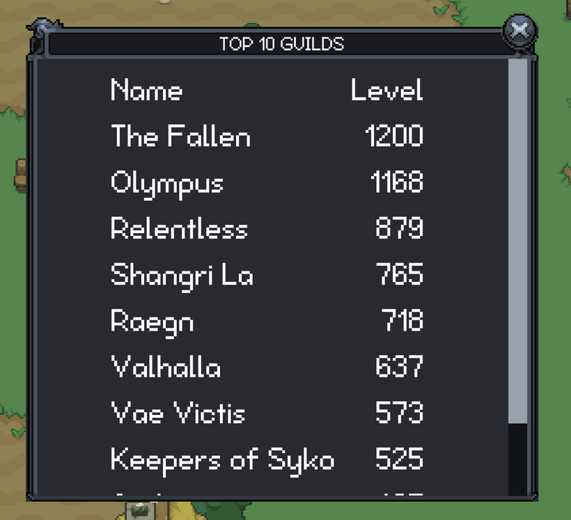
After the player leaderboard, I moved on to the guild leaderboards. The regular guild leaderboard was a good follow-up because it uses a much simpler version of the same idea: guild names and levels in a scrollable window. In the new engine, that now goes through the same reusable text table system as the player leaderboard, with localized labels, proper loading and failed states, measured columns, and cleaner row handling.
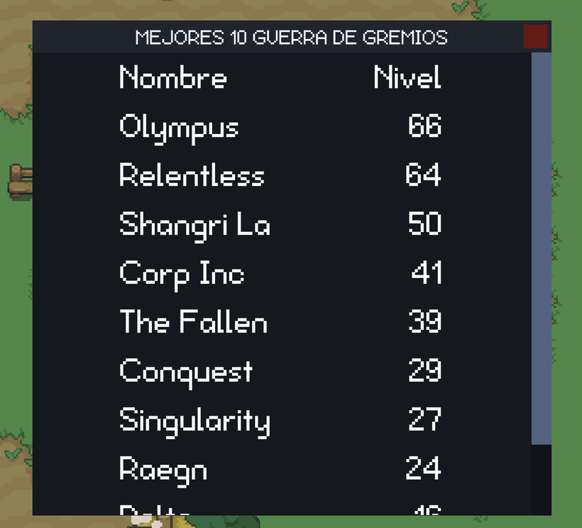
I also ported the guild warfare leaderboard, which follows the same layout but shows guild warfare level instead of normal guild level. I tested it with the minimal skin and Spanish localization, which was a good sanity check for the table sizing and localization work. Small window, but a good sign that the next few ports should be pretty straightforward.
And with that, all of our current leaderboards have made their way over to the PxEngine!
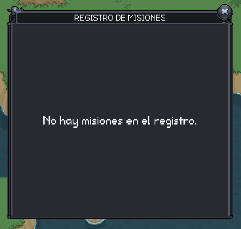
And here we go, let's start with the case where there are no quests and localize the text. It's not likely many people will ever see this but we have to account for every case. That's software development. You have to think of every single case that could possibly happen and then write code to handle it. It's quite maddening at times but that's the job.
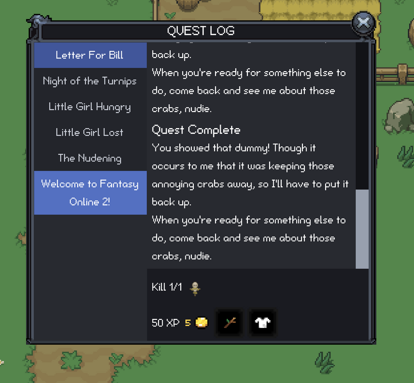
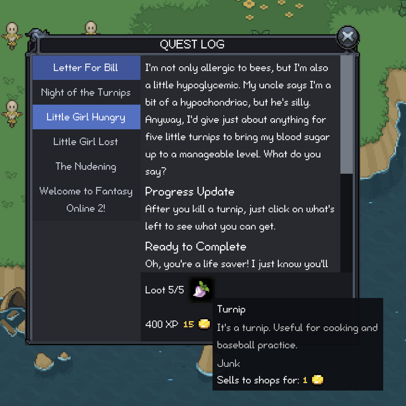
Once the empty state was handled, I started bringing over the actual quest log layout. This is one of those windows that looks simple until you start rebuilding it. You need the quest list on the left, the selected quest text on the right, a goal row, a reward row, scroll areas, selected states, completed states, localized text, and all of it has to behave correctly when the player has zero quests, one quest, a bunch of quests, or a quest title that wraps onto multiple lines.
The old client could get away with a lot of manual positioning because that is how most of those windows were built. The new engine is a different story. If a window needs a scrollable list, it should use the same list system as everything else. If text can wrap, the layout needs to measure it instead of guessing. If a scrollbar appears, the content width changes, and that means the wrapped height can change too. Those are the kinds of little details that make UI work take longer than people expect.
The quest log ended up being a great second test for the virtual scroll list. The leaderboards use fixed row heights, which is the easiest case. Quest titles are trickier because they can wrap. Some quest names are short, some are long, and localization can make them longer again. So the virtual list needed to support measured row heights, not just fixed row heights. That means the list asks a row how tall it needs to be at the current width, then uses that measurement to position the rows correctly.
That was a good improvement for the renderer. Now we have a virtual list that can handle both simple tables like leaderboards and more flexible rows like quest titles. It only creates the visible row nodes, but it still knows the full height of the list. That is exactly the kind of reusable engine feature I wanted out of this work.
The quest log itself is also much cleaner now. The selected quest updates the title list, the description scrolls separately from the goals and rewards, and the footer stays anchored at the bottom of the window. The goal row shows what the player needs to do, and the reward row shows the reward item and experience. It is still the same basic quest log players are used to, but it is now built on the new GUI system instead of being another one-off old client window.
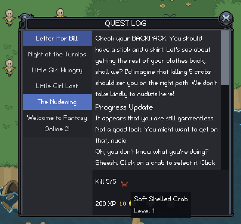
I also cleaned up the goal text a bit. At first I was showing the target name right in the goal line, so a kill quest might say something like “Kill 0/10 - Very Long Monster Name.” That works until the name is too long, then the whole row starts looking cramped. The better answer was to keep the visible goal line short and readable, then put the detailed target name in the item or monster tooltip. So the row says the important thing at a glance, and the tooltip has the extra context if the player wants it.
That led into another small but useful piece of work: mob display nodes and mob tooltips. Quest goals can point at monsters, so the quest log needed a way to show a monster icon just like it can show an item icon. The old approach for monsters was basically clipping and offsetting a full sprite sheet to show one frame. It worked, but it was not the cleanest thing to carry forward.
The new mob display uses the shared image cache, takes the loaded sprite sheet, slices out the idle forward frame, and displays that region directly. That is cleaner, easier to reason about, and it means the GUI is not laying out a giant sprite sheet just to show one little monster icon. The mob tooltip now shows the monster name and level too, which gives the quest goal row the extra information it needs without cluttering the main text.
There was also a lot of boring but important testing in this stretch. I checked the quest log with no quests, with active quests, with completed quests, with long quest names, with scrolling on the title list, and with scrolling in the quest text. I also went back through the leaderboards after changing the virtual scroll list, because touching shared renderer code always has the chance to break something that was already working.
That is the funny thing about building engine systems. The actual visible feature might be “the quest log works now,” but a lot of the work is making sure the shared pieces underneath it are not secretly tailored to one window. The virtual list started with the player leaderboard, then had to grow for the quest log, and now it is in a better place for the next batch of windows.
After that, I kept pushing on the quest log because getting the window to display correctly is only half the job. The other half is making sure it stays useful while the game is changing around it.
One of the big pieces was quest target highlighting. The quest log can tell you what you need to do, but the world also needs to help point you in the right direction. For kill quests, that means identifying the monsters tied to the active quest. For collection quests, it is a little less direct. A collection quest asks for an item, but the player usually needs to know which monsters can drop that item.
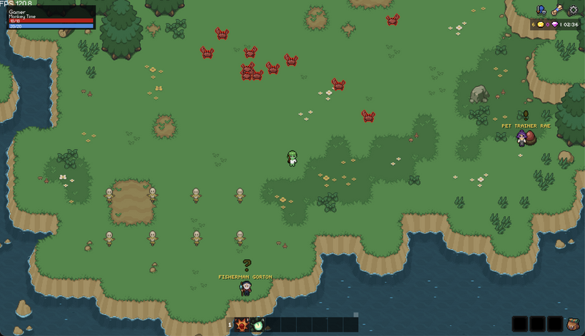
Right now I am experimenting with outlining active quest targets in the world. I am not 100% sure this is the final visual style, though. Another option would be to show enemy names overhead and color quest target names differently, maybe red or some other obvious color, so the information is still there without drawing a full outline around the sprite.
I would love to hear what people think about this. Do the outlines feel helpful, or do they look out of place? Would colored overhead names be better? Have a better idea for highlighting mobs that are targets of currently active quests? Comment below and let me know, because this is exactly the kind of thing that is easier to tune with player feedback.
Under the hood, the important part is that the client now knows which monsters are valid quest targets. It uses mob definition data instead of trying to guess from names. Mob definitions are indexed by drop item id, so the quest targeting system can say, “this quest needs item X, and these monsters can drop item X.” That gives the world enough information to mark the right targets without turning the actor system into a pile of quest-specific rules.
I also spent some time on world and HUD feedback. The new actor selection HUD can show information for the selected actor, and some of the screenshots show little info panels in the top left while I was testing that work. Those panels are connected to targeting, selection, quest highlighting, and actor state, but they are temporary debugging panels, not finished UI, so please do not judge those too harshly yet.
I also tightened up quest log selection behavior. If the selected quest completes, the window should move to another useful quest instead of showing stale data. If a quest completes in the background while you are reading another quest, it should not yank the selection away from what you were looking at. Those are small details, but they are the kind of details that make a window feel stable.
After the leaderboard and quest log work, I spent some time restoring more of the world feedback that old players expect from the old client.
Casting particles and the level-up animation are both hooked up in the new engine now. Actors show the casting effect while a spell is being cast, and the effect stops when the cast finishes or gets cancelled. Level-up animations now play at the actor’s feet through the new effect system, using the packed animation sheet that combines the old layers into one image.
I also moved effects over to the non-uniform texture atlas path. Effects come in different sizes, so this lets the renderer pack them by their actual dimensions and reuse uploaded texture regions instead of treating every effect like it belongs in a fixed-size grid.
The biggest push in this stretch was still the quest return footstep guide from the start of the post.
I already showed the final result at the top, but getting there took a lot of iteration. The first version tried to build on a more complicated path corridor approach, and it kept running into problems: long pauses on big paths, path snapping, strange loops, unstable smoothing, and paths that could look fine one moment and bizarre the next. Eventually I gutted that direction and rebuilt the system around a simpler guide pathfinder that is separate from the exact movement pathfinding.
That ended up being the right call. The guide path does not need to be the same thing as the path your character uses to walk. It needs to be fast, stable, zone-local, and readable. It uses the collision data to build a rough path through the zone, then the renderer turns that route into footsteps that sit in the world.
The visual side took a lot of tuning too. A line was useful for debugging, but it did not feel like part of the game. Footsteps work much better, but they brought their own problems. If every update rebuilds the entire row of footsteps from the player’s exact current position, then strafing left and right makes the whole path slide around like floating decals. The guide now tries to keep the path visually stable and only meaningfully updates when it should, so the footsteps feel more like a route on the ground instead of something glued to your feet.
There is still room to improve the art, and I am sure the footprints will keep getting adjusted, but the system itself is finally in a really promising place. It can path across Noob Island quickly, it updates while you move, and it gives us a foundation for much better navigation tools.
Finally, I did another pass on the quest log itself.
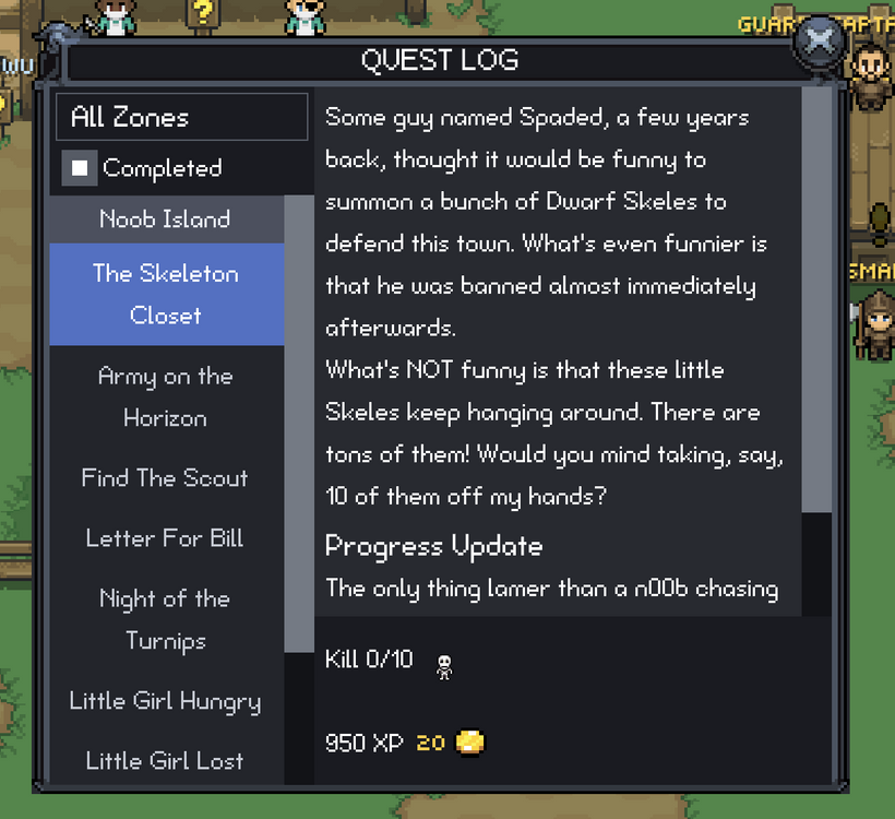
The quest log now has filters above the quest list. You can show or hide completed quests, and you can filter by zone. The zone list is inferred from the quests in your log instead of showing every zone in the game, so it does not reveal places you have not encountered yet. The filter labels are localized, the empty-filtered state wraps correctly, and the zone filter is reusable instead of being hardcoded directly into the quest log.
That leaves this stretch of work in a pretty good place. Actor feedback is closer to the old client, effects are using a better texture path, the footstep guide is finally working across a whole zone, and the quest log is more useful as it starts to grow.
A lot of this was not one giant feature. It was a long chain of old-client behavior being rebuilt in the new engine with cleaner boundaries and better reusable pieces along the way. The visible result is more effects, filters, footsteps, and world feedback working in-game. The deeper result is that the new engine keeps getting stronger each time another piece comes over.
To close things out, I added one more video showing the latest PxEngine work running together in-game. It is one thing to talk through individual systems, but it feels much better seeing the new UI, quest work, level-up effects, and footstep guide all moving in the same client.
Abandoning quests will also be coming to PxEngine soon. That is a new quest log action that needs to be added.
As always, please post any comments or feedback here, on Discord, or email me at [email protected]. I especially want feedback on the visual parts of this update, like quest target highlighting and the footstep guide.
This has been a long five months of PxEngine development. We just crossed 50,000 lines of mostly pretty difficult code, and I am finally starting to see the light at the end of the tunnel. The plan is for PxEngine to replace the old engine sometime this summer.
A quick testing note: fifth-slot characters have been reset again.
Next devlog is in 1 week.